
티스토리 뷰
1. 내비게이션
data class MainNavItem(
    val route: String,
    val routeWithPostFix: String = route
)

data class BottomNavItem(
    val title: String,
    val route: String,
    val routeWithPostFix: String = route,
    @DrawableRes
    val icon: Int
화면을 담당하는 MainNavItem과 바텀 내비게이션을 담당하는 BottomNavItem을 만들었습니다.
구분을 해서 만드는 게 필수는 아니지만 사용처에 따라 구분을 하면 불필요한 데이터를 넣을 필요도 없고 좀 더 알아보기 쉬워서 위와 같이 만들었습니다.
sealed class NavScreen(val item: MainNavItem) {
    object PokemonDex: NavScreen(
        MainNavItem(
            route = "PokemonDex"
        )
    )

    object PokemonCounter: NavScreen(
        MainNavItem(
            route = "PokemonCounter"
        )
    )

        ... 중략 ...
}
메인 아이템입니다.
sealed class를 이용해서 만들어 주었습니다.
enum class BottomNavItems(val item: BottomNavItem) {
    Home(
        item = BottomNavItem(
            title = "홈",
            route = "Home",
            icon = R.drawable.ic_home
        )
    ),
    Game(
        item = BottomNavItem(
            title = "게임",
            route = "Game",
            icon = R.drawable.ic_game_pad
        )
    ),

    ... 중략 ...
}
바텀 내비게이션의 아이템입니다.
일반 클래스나 메인 아이템처럼 sealed class로 만들 수 있지만, enum class로 만든 이유는 나중에 사용할 때 리스트로 불러오기 위함입니다.
@Composable
fun NavigationGraph(
    navController: NavHostController
) {
    val onBackClick: () -> Unit = { navController.popBackStack() }

    NavHost(
        navController = navController,
        startDestination = BottomNavItems.Home.item.routeWithPostFix
    ) {
        /** 홈 화면 **/
        composable(
            route = BottomNavItems.Home.item.routeWithPostFix
        ) {
            HomeScreen()
        }
        gameScreens(onBackClick, navController)
        calendarScreens(onBackClick, navController)
        plantScreens(onBackClick, navController)
        otherScreens(onBackClick, navController)
    }
}

fun NavGraphBuilder.gameScreens(
    onBackClick: () -> Unit,
    navController: NavHostController
) {
    /** 게임 화면 **/
    composable(
        route = BottomNavItems.Game.item.routeWithPostFix
    )
        ... 중략 ...
}
내비게이션을 컨트롤할 그래프입니다.
NavHost 안에 너무 많은 화면들이 있을 경우에는 수정할 때 찾기가 불편해서
홈 화면을 제외하고 바텀 내비게이션의 텝을 기준으로 분리해서 만들어 보았습니다.
@Composable
fun MainScreen() {
    val navController = rememberNavController()

    Box(
        modifier = Modifier
            .fillMaxSize()
            .background(MyColorWhite)
    ) {
        NavigationGraph(navController = navController)
        BottomNavigationBar(
            navController = navController,
            onClick = { value ->
                navController.navigate(value)
            },
            modifier = Modifier.align(Alignment.BottomCenter)
        )
    }
}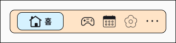
이번 바텀 내비게이션은 위와 같은 디자인을 가지고 있습니다.
바텀 내비게이션을 만드는 기본적인 방법은 Material의 Scaffold에서 제공하는 bottomBar와 BottomNavigation, BottomNavigationItem를 이용해서 바텀 내비게이션을 표시하는 것입니다.
Material의 기능을 그대로 이용하면 원하는 결과가 나오지 않아서 커스텀을 이용해서 제작하였습니다.
Box를 이용하여 위치를 조정하여 사용하였습니다.
@Composable
fun BottomNavigationBar(
    navController: NavController,
    onClick: (String) -> Unit,
    modifier: Modifier = Modifier
) {
    val items = BottomNavItems.values().map { it.item }
    val backStackEntry by navController.currentBackStackEntryAsState()
    val isVisible = items
        .map { it.routeWithPostFix }
        .contains(backStackEntry?.destination?.route)

    if (isVisible) {
        Row(
            modifier = modifier
                .fillMaxWidth()
                .padding(start = 20.dp, end = 20.dp, bottom = 10.dp)
                .clip(RoundedCornerShape(10.dp))
                .border(1.dp, MyColorBlack, RoundedCornerShape(10.dp))
                .background(MyColorBeige)
        ) {
            Spacer(modifier = Modifier.width(10.dp))
            items.forEach {
                MyBottomNavItem(
                    item = it,
                    selected = backStackEntry?.destination?.route == it.routeWithPostFix,
                    onClick = onClick
                )
            }
            Spacer(modifier = Modifier.width(10.dp))
        }
    }
}
바텀 내비게이션이 모든 화면에서 출력될 것은 아니고 홈 화면을 포함하여 BottomNavItems의 주소를 가진 화면에서만 표시가 됩니다.
navController.*currentBackStackEntryAsState*()를 이용하여 NavBackStackEntry를 받아오고,
destination?.route를 사용하면 현재 페이지의 주소를 가져올 수 있습니다.
이 주소와 BottomNavItems의 아이템들의 주소가 포함될 때에만 바텀 내비게이션을 출력합니다.
@Composable
fun RowScope.MyBottomNavItem(
    item: BottomNavItem,
    selected: Boolean,
    onClick: (String) -> Unit
) {
    val background = if (selected) MyColorSkyBlue else Color.Transparent
    val border = BorderStroke(1.dp, if (selected) MyColorBlack else Color.Transparent)
    val weight = animateFloatAsState(targetValue = if (selected) 1f else 0.4f)

    Row(
        verticalAlignment = Alignment.CenterVertically,
        horizontalArrangement = Arrangement.Center,
        modifier = Modifier
            .weight(weight.value)
            .heightIn(max = 47.dp)
            .padding(vertical = 6.dp)
            .clip(RoundedCornerShape(10.dp))
            .border(border, RoundedCornerShape(10.dp))
            .background(background)
            .nonRippleClickable { onClick(item.routeWithPostFix) }
    ) {
        Image(
            painter = painterResource(id = item.icon),
            contentDescription = item.title,
            modifier = Modifier
                .padding(vertical = 5.dp)
                .size(27.dp)
        )
        AnimatedVisibility(visible = selected) {
            Text(
                text = item.title,
                style = textStyle16B(),
                modifier = Modifier.padding(start = 5.dp)
            )
        }
    }
}
animateFloatAsState와 AnimatedVisibility를 이용해서 선택되었을 때 애니메이션 효과를 주었습니다.
선택 영역을 크기로 할지 비율로 할지 고민을 했었는데 크기는 너무 고정인 거 같아서 비율로 하였습니다.
비율도 선택된 영역 1 / 비선택 영역 총합 1로 처음에 했는데 선택된 영역이 너무 커서 비율을 조정하였습니다.
2. 더블 카드
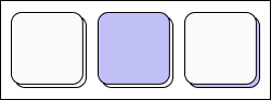
이번 디자인의 컨셉에서 가장 많이 이용된 요소입니다.
카드 2개가 겹쳐있는 형태여서 더블 카드라고 이름을 정했고
카드 상태는 3가지로 나뉩니다.
- 상단/하단 카드 모두 색이 없는 경우
- 상단 카드에만 색이 있는 경우
- 하단 카드에만 색이 있는 경우
상단/하단 모두 색이 있는 경우는 없습니다.
@Composable
fun DoubleCard(
    modifier: Modifier = Modifier,
    connerSize: Dp = 10.dp,
    topCardColor: Color = MyColorWhite,
    bottomCardColor: Color = MyColorWhite,
    minHeight: Dp = 10.dp,
    contents: @Composable () -> Unit
) {
    ConstraintLayout(modifier = modifier) {
        val (topCard, bottomCard) = createRefs()
        Card(
            colors = CardDefaults.cardColors(
                containerColor = bottomCardColor
            ),
            modifier = Modifier
                .clip(RoundedCornerShape(connerSize))
                .heightIn(min = minHeight)
                .border(1.dp, MyColorBlack, RoundedCornerShape(connerSize))
                .constrainAs(bottomCard) {
                    top.linkTo(parent.top, 3.dp)
                    start.linkTo(parent.start, 3.dp)
                    end.linkTo(parent.end)
                    bottom.linkTo(topCard.bottom, (-3).dp)

                    width = Dimension.fillToConstraints
                    height = Dimension.fillToConstraints
                }
        ) {}

        Card(
            colors = CardDefaults.cardColors(
                containerColor = topCardColor
            ),
            modifier = Modifier
                .clip(RoundedCornerShape(connerSize))
                .heightIn(min = minHeight)
                .border(1.dp, MyColorBlack, RoundedCornerShape(connerSize))
                .constrainAs(topCard) {
                    top.linkTo(parent.top)
                    start.linkTo(parent.start)
                    end.linkTo(parent.end, 3.dp)

                    width = Dimension.fillToConstraints
                }
        ) {
            contents()
        }
    }
}
더블 카드를 만들 때에는 위의 요소들을 받습니다.
상단/하단 카드 모두 기본적으로는 흰색을 가지고 있고 원하는 색상이 있을 때만 받도록 설정하였습니다.
배치의 경우 Box를 써도 가능할 것 같은데 저는 이런 쪽은 ConstraintLayout이 편해서 사용하였습니다.
최소 높이는 특정 UI를 만들 때 오류가 발생해서 넣어주었습니다.
3. 스피너
@OptIn(ExperimentalFoundationApi::class)
@Composable
fun SelectSpinner(
selectList: List<String>,
state: PagerState,
initValue: String,
width: Dp = 90.dp,
modifier: Modifier = Modifier
) {
Box(modifier = modifier) {
VerticalPager(
contentPadding = PaddingValues(vertical = 60.dp),
state = state,
modifier = Modifier
.size(width, 180.dp)
) { index ->
Box(
contentAlignment = Alignment.Center,
modifier = Modifier.size(width, 60.dp)
) {
Text(
text = selectList[index],
style = textStyle24B().copy(fontSize = 22.sp),
modifier = Modifier.graphicsLayer {
val pageOffset = ((state.currentPage - index)
+ state.currentPageOffsetFraction).absoluteValue
alpha = lerp(
start = 0.2f,
stop = 1f,
fraction = 1f - pageOffset.coerceIn(0f, 1f)
)
}
)
}
}
Box(
modifier = Modifier
.padding(top = 60.dp)
.size(width, 1.dp)
.background(MyColorGray)
)
Box(
modifier = Modifier
.padding(top = 120.dp)
.size(width, 1.dp)
.background(MyColorGray)
)
}
LaunchedEffect(Unit) {
val index = selectList.indexOf(initValue)
state.scrollToPage(if (index == -1) 0 else index)
}
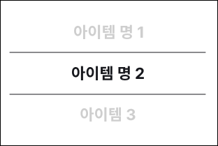
}아이템을 선택해야 하는 UI들이 몇 개 있어서 SelectSpinner를 만들었습니다.
저는 VerticalPager를 이용해서 구현을 하였습니다.
Text(
    text = selectList[index],
    style = textStyle24B().copy(fontSize = 22.sp),
    modifier = Modifier.graphicsLayer {
        val pageOffset = ((state.currentPage - index)
                + state.currentPageOffsetFraction).absoluteValue
        alpha = lerp(
            start = 0.2f,
            stop = 1f,
            fraction = 1f - pageOffset.coerceIn(0f, 1f)
        )
    }
)
가장 중요한 코드는 이 부분으로, 현재 아이템(가운데 아이템)의 색상은 검은색으로 그렇지 않은 아이템은 회색으로 표시를 하는 코드입니다.
VerticalPager의 State 값을 이용해 Offset 값을 구한 뒤 스크롤 상태에 따라 텍스트의 투명도를 조절하였습니다.
구분선의 경우 VerticalPager의 아이템 요소에 넣지 않고 고정 위치로 설정하였습니다.
LaunchedEffect(Unit) {
    val index = selectList.indexOf(initValue)
    state.scrollToPage(if (index == -1) 0 else index)
}
LaunchedEffect를 이용해서 initValue의 값에 맞게 최초 선택된 아이템이 보이도록 하였습니다.
이 외의 공통사항이 생기면 글을 업데이트할 예정입니다.
'안드로이드 > 코드' 카테고리의 다른 글
| Mj App : 게임 - 포켓몬 (0) | 2023.06.27 |
|---|---|
| Mj App : 게임 - 엘소드 (0) | 2023.06.27 |
| Compose 내 관리앱 만들기 : 3. 교통 - 지하철 (0) | 2023.03.19 |
| Compose 내 관리앱 만들기 : 2. 교통 - 버스 (0) | 2023.03.19 |
| Compose 내 관리앱 만들기 : 1. 프로젝트 구성 (0) | 2023.03.19 |
- Total
- Today
- Yesterday
- Pokedex
- Compose BottomSheet
- compose
- Compose Naver Map
- Kotlin
- LazyColumn
- 웹뷰
- Fast api
- Compose 네이버 지도
- WebView
- Duplicate class found error
- Worker
- 안드로이드
- Android
- Compose ConstraintLayout
- 포켓몬 도감
- Compose QRCode Scanner
- Compose ModalBottomSheetLayout
- Row
- Android Compose
- Compose BottomSheetScaffold
- Compose 네이버 지도 api
- 안드로이드 구글 지도
- Compose MotionLayout
- Duplicate class fond 에러
- WorkManager
- column
- Retrofit
- Compose BottomSheetDialog
- Gradient
| 일 | 월 | 화 | 수 | 목 | 금 | 토 |
|---|---|---|---|---|---|---|
| 1 | ||||||
| 2 | 3 | 4 | 5 | 6 | 7 | 8 |
| 9 | 10 | 11 | 12 | 13 | 14 | 15 |
| 16 | 17 | 18 | 19 | 20 | 21 | 22 |
| 23 | 24 | 25 | 26 | 27 | 28 |